 First impressions matter, whether designing channel letters for a retail storefront or an opulent monument sign, there’s more that goes into creating an effective, custom sign than a cool logo or fancy design. Even the most well-designed logos and graphics can be challenging to translate into a tangible monument or channel letter sign that follows a company’s brand. That’s where FSGS comes in!
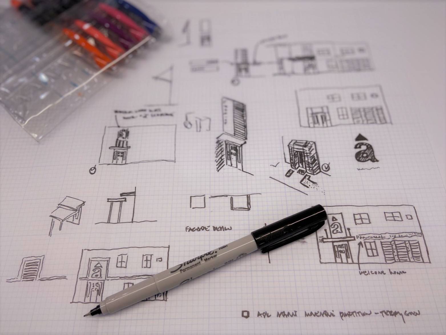
Creating the highest quality signs requires a partnership between professional designers and sign manufacturers. We asked our team to weigh in on some of the things NOT to do when creating a design for a sign.
Most Common Sign Design Mistakes:
- Using illegible fonts with serifs and not enough “stroke” width (character width), making fabrication both labor-intensive and expensive.
- Not planning or factoring in material availability. Materials come in various sizes, and we can help you keep your designs efficiently priced and beautiful. Through material considerations, you’ll minimize waste and welding seams.
- Being wordy or crowding space with graphics or logos. Less is always more in sign design. The audience only has a few seconds to glance at your sign when they pass by, so we can help you grab their attention in those precious few seconds.
- Font that is too small, or not enough contrast between text and background. Consider the audience’s distance from the sign and optimal visibility when selecting contrast between colors, or risk the sign being difficult to read and ineffective.
- Failure to follow city ordinances in your custom sign design, resulting in permit issues. Always check local municipal ordinances before designing your signs. Most cities have ordinances outlining maximum size as well as allowed materials and finishes for commercial signs. Here’s a quick reference that shows many sign ordinances.
- Failure to consider technical details of sign fabrication and mounting. Consider the entire process, from design to fabrication and installation, otherwise the sign — even if it meets all standards of graphic design and looks amazing — may need to be edited prior to fabricating. As an example, a heavy sign shouldn’t hang on non-loadbearing walls.
Consider these tips to ensure your design looks just as good on the fabricated sign as it does in your conceptual designs.
Keep reading if you’d like more in-depth info:
Fonts, sizes, and strokes
There are limitations to the size of letters in the manufacturing of three-dimensional channel letters and monument signs. The minimum size we manufacture for any font is 7 inches, except for serif fonts, which must be fabricated at a minimum of 12 inches for legibility.
The smaller the letter, the more labor-intensive, difficult, and time-consuming the sign is to fabricate. These factors all influence the overall cost of your design. Not only must letter height be considered, but also the weight of the stroke.
Each letter stroke should be a minimum of one-and-a-half inches wide to accommodate LEDs and tools for fabrication. Even a non-illuminated sign should follow these guidelines, simply because of the time it will take and the tools used to fabricate a sign with narrow strokes.
Material limitations and availability
The potential need to accommodate seams in the design must be kept in mind as there are limitations in available sizes of materials used for sign manufacturing, such as acrylic, aluminum, aluminum composite panels, and vinyl. Work directly with the sign manufacturer to determine available sizes of products to minimize seams and material waste.
For example, when designing illuminated channel letters larger than 24-feet, the sign would have two seams, risking light leaking from the seams. Additionally, the larger the sign, the more flexible acrylic becomes. If improperly installed, the face of the sign will begin to shift, leading to light leakage and breaks, causing the sign to look unevenly lit and unprofessional.
The custom sign experts at FSGS can recommend options to break a sign into sections or properly identify inconspicuous places for seams, resulting in high-quality fabricated signs.
Digital print vs vinyl
When designing colorful, custom signs, it’s important to consider whether the sign requires the use of stock vinyl or digital prints. Vinyl application is available in a variety of name brands and colors, offering thousands of color options to match the brand’s standards. Vinyl also provides approximately seven years of outdoor durability compared to just two to four years of outdoor durability of digital printing.
Electrical considerations
Finally, consideration must be made regarding how electrical will be supplied to a sign. If the sign will be mounted on the facade of a building, where will the photocell and electrical junction box be located? Will the sign be mounted on a raceway or remotely mounted? For successful installation and an aesthetically pleasing presentation, electrical considerations must be accounted for in the sign’s layout and design.
If you’re working on a sign design or the initial branding for physical buildings, bring FSGS in as part of your team on the front end. We will consult with you on the design, ensuring you’re headed down the right path toward successful brand design that also translates into professional-looking signs. Our team will develop shop drawings specifying mounting options and details to make sure the end product of your sign looks exactly as shown on presentations and renderings. Our designers, fabricators, and installers follow the requirements of NEC (National Electrical Code and UL).
Contact us today to learn more about our process and services.
Tags
Keep Reading
Thought Leadership
Seamless Custom Signage Solutions: What A Dedicated Partner Can Do For You
10 MIN READ
Thought Leadership
Weaving Signage Strategy Into Your Master Planning
10 MIN READ
News & Events
Red Elephant (AIM & N Graphic Solutions) Ranks No. 1779 on the 2023 Inc. 5000 List
10 MIN READ
Back To Blog
The Ultimate Buyers Guide
Complete the form below for a free guide you can use to prepare before our meeting.